Visual design is the strong foundation of every great digital product. It’s how we arrange the basic pieces, the elements of design, to make experiences that are appealing and simple to use. Great visual design is more than just decoration. It’s a method of strategic visual communication. It guarantees users feel guided when they interact with a user interface. Understanding the core visual design elements and principles is essential for everyone. This guide breaks down the key parts and rules you must master. Focus only on these basics to boost your design skills right now.
The Elements of Visual Design
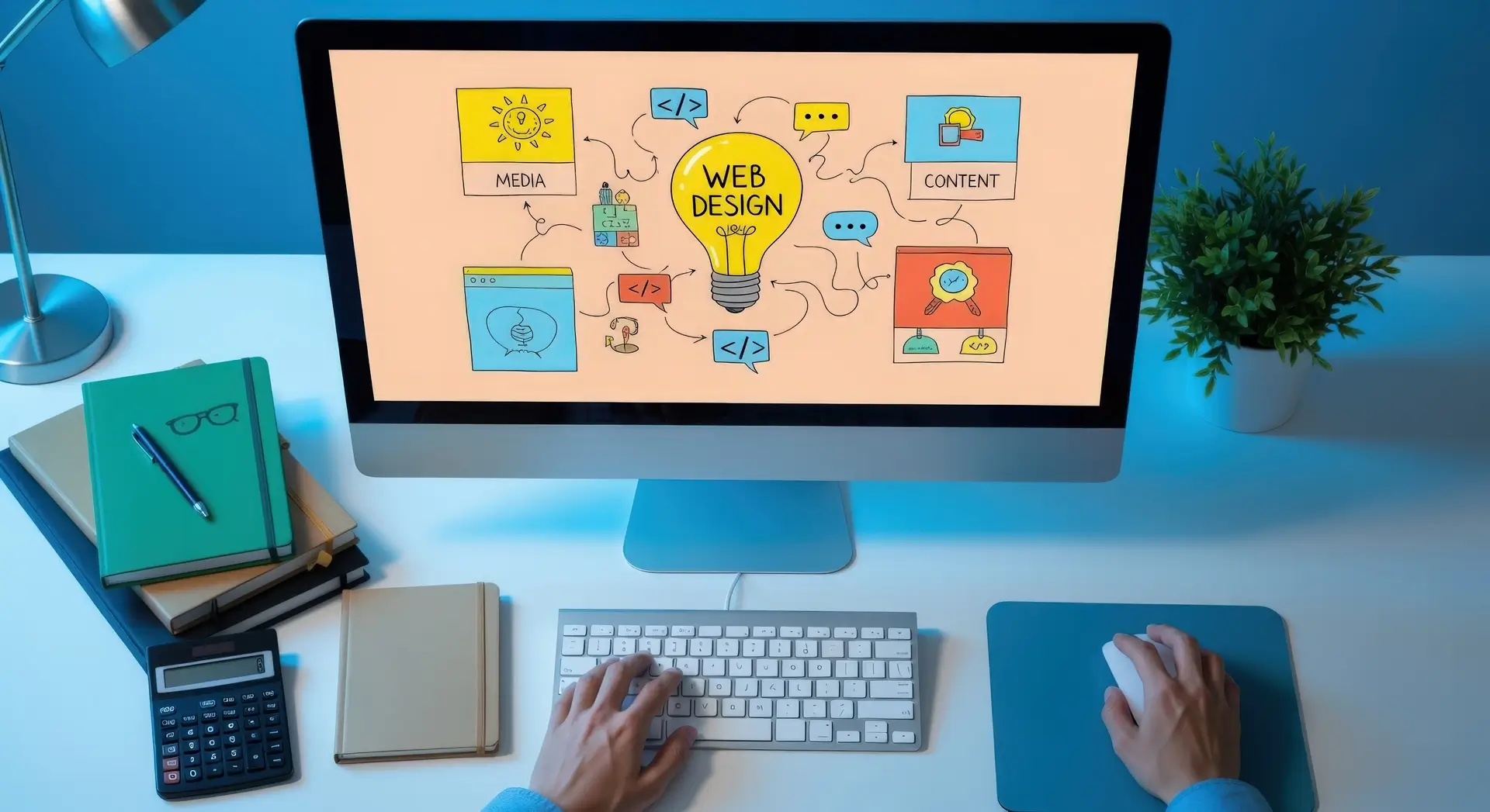
The elements of design are the raw materials for any composition. Think of them as the alphabet of visual design. By learning these, you control your final product’s look and feel. This section gives you a complete list of the elements of design with simple examples.
- Line
A line is the simplest element. It’s the path a moving point takes. Lines exist everywhere in digital products, even hidden ones.
- Definition: It directs the eye and defines shape.
- Usage: Lines create boundaries. They set up divisions in a layout composition. They can also suggest motion. Vertical lines show stability, while diagonal lines imply energy.
- Practical Tip: Use lines lightly in modern user interface design. White space often separates content better and looks cleaner.
- Shape
A shape is a line that closes in on itself. It defines a two-dimensional area. Shapes are the main graphic elements we use to show objects.
- Definition: Shapes are either geometric (squares, circles) or organic (free-form).
- Usage: Geometric shapes work well for buttons and structure. Organic shapes add friendliness and aesthetic appeal. Knowing form as an element of design helps sort information clearly.
- Practical Tip: Use geometric shapes consistently. This creates a predictable interaction design.
- Color
Color is likely the most powerful element. It quickly creates emotion and sets the mood for branding. It also grabs attention.
- Definition: It is light reflecting off surfaces. It is defined by its hue, value, and saturation.
- Usage: Using color theory well is crucial for hierarchy. Warm colors suggest action, while cool colors suggest calm.
- Practical Tip: Use color to create a strong contrast. Use only 2 or 3 main colors. This keeps your design visually harmonious. For projects needing a consistent brand identity, check out DevSphere Technologies for guidance.
- Value
Value means how light or dark a color is. It is vital for legibility and adding depth.
- Definition: It goes from pure white to pure black.
- Usage: A big difference in value creates contrast. This makes the text readable and the elements pop out. Designers also use small value changes. This creates the illusion of 3D volume.
- Practical Tip: Always test the value difference between your text and background. This ensures they meet contrast standards for accessibility.
- Texture
Texture is the quality of a surface. This can be visual or felt. In digital graphics, texture is usually implied.
- Definition: It hints at how something might feel (smooth, rough).
- Usage: Subtle textures add richness to flat graphic elements. In UI design, texture is often minimal. It relies on shadows to suggest smoothness.
- Practical Tip: Do not overuse texture. It can distract users. Use it carefully to emphasize small areas.
- Negative Space (Whitespace)
This empty area around your design pieces is also called white space. It is one of the most powerful elements of design.
- Definition: It is the space without content. This gives defined elements room to stand out.
- Usage: White space is critical for visual hierarchy. It groups related items. It also separates items that don’t belong together. Good spacing improves typography readability.
- Practical Tip: Never fear large amounts of white space. It shows clarity and elegance, not wasted space.
- Typography
Typography is about written text. It is often treated as a core element. This is because of its basic role in communication.
- Definition: The look, style, and arrangement of text.
- Usage: Typography sets the design’s tone. It affects readability and structure. It works with layout composition to organize information.
- Practical Tip: Stick to just two fonts. Use boldness, size, and style for a clear hierarchy. Avoid changing the font itself too often. For complex digital applications, explore UI/UX Design Services for dedicated support.
2. The Core Visual Design Principles
The elements of design are the ingredients. The visual design principles are the recipe. These are the rules designers follow. They arrange the elements to make the final piece harmonious and functional. They direct the user’s attention perfectly.
Contrast
Contrast is the difference between two or more elements. It is key for getting attention and being legible.
- Definition: It can be size (large vs. small) or color (light vs. dark). It can also be shaped (geometric vs. organic).
- Usage: Strong contrast highlights important calls to action. It separates the background from the foreground. Text is unreadable without enough value contrast.
- Practical Tip: Always check the contrast on buttons. Use high contrast to show what is important.
Visual Hierarchy
Visual hierarchy shows how important different graphic elements are. It controls the order in which a user reads information.
- Definition: It prioritizes elements. It uses size, typography, and contrast to do this.
- Usage: The largest or darkest item gets the most attention. Designers use this to make sure users see the main headline first.
- Practical Tip: See hierarchy as a simple path. What are the user’s steps? Use scale and white space to clearly define each one. Specialized UX planning is needed for technical visual structure.
Balance
Balance is how visual design elements are spread out. It gives the design stability and structure.
- Definition: It can be symmetrical (equal weight on both sides). It can be asymmetrical (unequal weight, but still stable).
- Usage: Symmetrical balance is formal and stable. It works for classic branding. Asymmetrical balance is more modern. It is common in web layout composition today.
- Practical Tip: A small, bright object can balance a large, dull one. Color and value are important tools for asymmetrical balance.
Unity/Harmony
Unity makes all design parts feel like they belong together. It ensures the whole design is better than its parts.
- Definition: All elements of design examples share something in common. This could be style, font, or a color palette.
- Usage: This principle ensures the overall aesthetic appeal is cohesive. Harmony comes from repeating and being consistent with typography.
- Practical Tip: Consistency creates unity. Make sure all headings, forms, and buttons follow the same clear system.
Gestalt Principles
The Gestalt theory explains how our minds organize visual data. Designers use these rules for clarity.
- Definition: Principles include Proximity (close items are grouped). Similarity (like items are grouped). Closure (the mind fills gaps).
- Usage: Grouping elements with white space (Proximity) is vital. Using the same graphic elements (Similarity) for all buttons helps understanding.
- Practical Tip: Design forms by putting related fields close together. This uses Proximity to reduce the mental effort needed. This is a key part of effective UI development.
Scale/Proportion
Scale is the size of one element compared to others. Proportion is the size relationship between parts of a whole.
- Definition: Using size to show importance or distance.
- Usage: Larger elements look more important. A headline is much larger than the body text. This sets a clear visual hierarchy.
- Practical Tip: Use the scale purposefully. If two things matter equally, they should be the same size. Make one much bigger for a strong contrast.
For content strategy support, check out Content Marketing Services.
Rhythm/Repetition
Rhythm uses repeated graphic elements to create visual movement. This guides the user’s eye.
- Definition: Repeating an element creates a pattern. This pattern moves the eye across the page.
- Usage: Repeating color or spacing creates continuity. This makes the user interface predictable.
- Practical Tip: Repetition builds your branding style. Use the same corner rounding on all cards. This creates a clear visual rhythm. For repetitive tasks in Web Development services, consistency is non-negotiable.
Conclusion
Mastering visual design means knowing the elements and principles deeply. See the elements of design examples (line, color, shape) as strategic tools, not just decoration. Use visual design principles (hierarchy, balance, contrast) to direct the user’s focus. This knowledge helps you build a predictable, sophisticated layout composition. It achieves true aesthetic appeal. By practicing these basics, you move from arranging items to powerful visual communication. Now, use this knowledge to audit your work. Great design comes from carefully applying these principles. To discuss a project needing the strict application of these rules, look into SEO Services for improved search visibility.
FAQs
What do you mean by visual design?
Visual design is the planned use of core elements of design and principles. It improves both the aesthetic appeal and usability of an interface. It uses color theory and typography to build a strong visual hierarchy. This ensures the product is attractive and clearly communicates information to the user.
What are the 7 basic elements of visual design?
The basic elements of visual design are Line, Shape, Negative Space (or White Space), Volume, Value, Color, and Texture. These fundamental elements of design are the designer’s building blocks. They are arranged using visual design principles like contrast and balance to create a cohesive layout composition.
What is visual design vs. graphic design?
The difference between visual design vs. graphic design is often about what they apply to. Graphic design focuses on static things like logos or brochures. It uses elements of art examples for communication. Visual design works on interactive digital products (like apps). It ensures the whole look and feel of the user interface supports the user experience.
What are visual design examples?
Key visual design examples include using white space to separate paragraphs (using Proximity). They also include using strong color theory to make the main button stand out (using contrast). Or, they involve choosing a sophisticated typography system for brand tone. These choices directly affect the visual hierarchy and overall clarity.
What does a visual designer do?
A visual designer defines the product’s look and aesthetic appeal. They focus heavily on the elements of design and principles of design. They choose the final graphic elements, set up the layout composition, and ensure the visual identity matches the brand. They make the user interface engaging and technically clear.