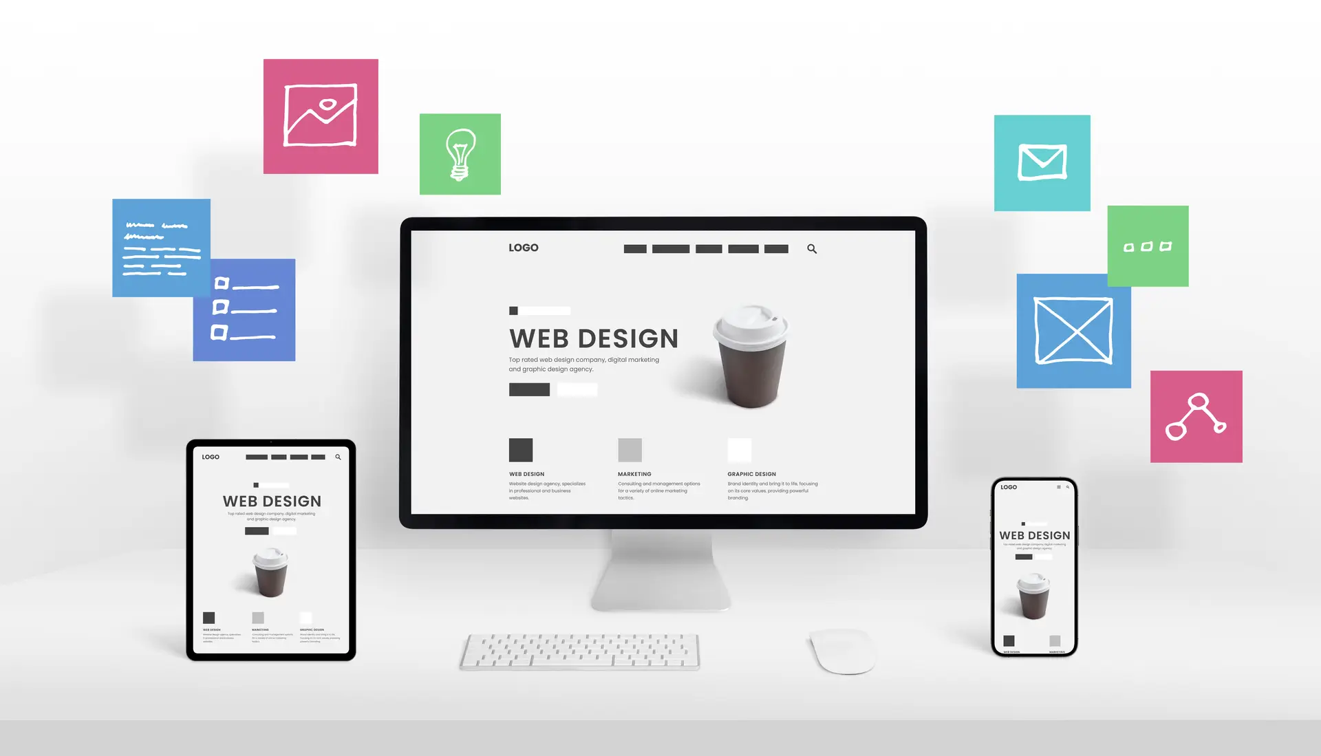
In 2026, over 60% of US web traffic comes from mobile devices. If your site is not easy to use, you lose customers. Many US businesses lose 40% of their conversions on mobile screens. To solve this, you must understand responsive web design. This approach ensures your website looks great on every single screen. It uses flexible layouts to adapt to phones, tablets, and desktops. This guide explains how it works and why it grows your revenue. By the end, you will know how to build a better site. You can use these tips to boost your brand visibility online. This strategy is vital for any modern digital marketing plan today.
Mastering responsive web design is no longer just a technical choice for developers. It is a critical business decision for SaaS founders and e-commerce owners. A good responsive website provides a seamless user experience across all devices. This helps you build trust and authority with your target audience. In 2026, search engines prioritize sites that work well on mobile phones. This means your web design directly impacts your organic search rankings. Following these principles will help you gain a massive competitive edge. Let us dive into the history and core mechanics of this system.
Responsive Web Design Defined and History
Responsive web design is a way to build sites that adapt fluidly. This concept was first introduced by Ethan Marcotte back in 2010. He argued that web pages render differently based on screen size. Before this, developers built separate sites for mobile and desktop versions. That old method was very expensive and hard to maintain properly. Now, we use a single codebase for all mobile devices. This saves time and ensures your brand message stays very consistent. Your responsive layout will adjust automatically to the user’s viewport width.
RWD Evolution and Milestones
| Year | Milestone | Business Impact in the US |
| 2010 | Ethan Marcotte Article | Fluid grids became the new standard |
| 2015 | Mobilegeddon Update | Google started rewarding mobile-friendly sites |
| 2019 | Mobile-First Indexing | Desktop-only sites saw a huge ranking drop |
| 2026 | Container Queries | Components now adapt to their own space |
In 2026, Google uses Google mobile-first indexing for almost every website. If your site fails the mobile test, your rankings will suffer. Data shows that responsive website design can boost rankings by 21%. This is why US agencies focus so much on mobile usability. A device-friendly website design is the foundation of modern digital success. It ensures your web pages render perfectly for every potential customer. This leads to a much better user experience for everyone involved. You should prioritize this to keep your business growing and thriving.
Principle 1: Fluid Grids and Flexible Layouts
The first pillar of responsive web design is using fluid grids. Old designs used fixed pixels, which did not scale well at all. Today, we use relative units like percentages or the “fr” unit. This allows your flexible web layout to expand or shrink naturally. Grid systems help you organize your content in a clean way. They ensure that your content hierarchy remains clear on small screens. Your responsive website layout will look balanced on an iPhone or iMac. This is a core part of modern web design techniques.
Flexible Units Comparison for Designers
| Unit Name | Use Case | Example Code Value |
| Percentage (%) | General containers | width: 90%; |
| Viewport Width (vw) | Full-screen sections | width: 100vw; |
| Fraction (fr) | Grid column sizing | grid-template-columns: 1fr 2fr; |
| Rem / Em | Spacing and fonts | padding: 1.5rem; |
Code Example 1: Basic Responsive Flexbox Navigation
CSS
/* Simple flexible navigation layout */
.nav-container {
display: flex;
justify-content: space-around;
}
/* Stack items on small mobile screens */
@media (max-width: 600px) {
.nav-container {
flex-direction: column;
align-items: center;
}
}
Using these tools helps you build a flexible web layout easily. It allows your team to create modern website standards for clients. This approach scales perfectly with our internal UI/UX workflows for better results. You can ensure that your adaptive user interface stays very functional. This is how you create a seamless user experience for users. It makes your site feel professional and very high quality.
Principle 2: Flexible Images and Media
The second pillar of responsive web design is using flexible images. Images must scale within their containing elements to avoid layout breaks. We use the CSS property “max-width: 100%” to achieve this goal. This prevents responsive images from becoming larger than their parent container. In 2026, we also use the picture tag for better performance. This allows you to serve different images based on the device. It helps you save bandwidth and improve your mobile page speed.
Responsive Image Techniques for Performance
| Technique | HTML/CSS Code Example | Bandwidth Saved |
| Max-Width | img { max-width: 100%; } | 50% average |
| Srcset | img srcset=”small.jpg 500w” | 70% average |
| Picture Tag | <picture> <source…> </picture> | 85% average |
| Lazy Loading | img loading=”lazy.” | High initial save |
Code Example 2: Using Picture Tag for E-commerce
HTML
<picture>
<source srcset=”product-large.webp” media=”(min-width: 1024px)”>
<source srcset=”product-tablet.webp” media=”(min-width: 768px)”>
<img src=”product-mobile.webp” alt=”Featured Product”>
</picture>
Your mobile-friendly website needs fast-loading images to keep users happy. High-resolution photos can slow down your mobile browsing experience significantly. By using responsive images, you improve your Core Web Vitals optimization. This is a major factor for your Google search ranking today. US e-commerce brands see a 30% boost in LCP scores. This leads to much improved website usability for every single shopper. You should always optimize your media for smartphone website optimization.
Principle 3: Media Queries and Breakpoints
The third pillar of responsive web design involves media queries. These are CSS rules that apply styles based on device features. You can change the layout when the viewport width reaches a limit. These limits are known as breakpoints in the design world. In 2026, we follow a mobile-first design approach for all projects. This means we code for the smallest screen first and expand. This makes your responsive web development much cleaner and faster.
Standard Breakpoints for US Mobile-First Sites
| Breakpoint Name | Min-Width Value | Target Device Type |
| Mobile | 320px | Small smartphones |
| Mobile Landscape | 480px | Large phones |
| Tablet | 768px | iPads and tablets |
| Desktop | 1024px | Laptops and monitors |
| Large Desktop | 1440px | High-res displays |
Code Example 3: Mobile-First Grid Layout
CSS
/* Base styles for mobile devices */
.main-grid {
display: grid;
grid-template-columns: 1fr;
}
/* Adjust for larger tablet screens */
@media (min-width: 768px) {
.main-grid {
grid-template-columns: 1fr 1fr;
}
}
In 2026, we also use container queries for modular components. This is a huge leap in responsive UI design technology. It allows a single component to adapt to its parent container. This is much better than just looking at the whole viewport. It helps you build a more adaptive website design overall. Your content prioritization becomes much more effective with these new tools. This leads to a consistent design across devices for your brand. You can learn more about these web development trends on our blog.
Advanced Techniques: Viewport and Typography
A proper responsive web design requires the viewport meta tag. This tag tells the browser how to scale the page content. Without it, your site might look tiny on a smartphone. We also focus on scalable typography to improve readability for users. Using the “clamp()” function allows fonts to resize smoothly between limits. This ensures your visual hierarchy in design stays strong and clear. It helps you maintain accessibility in web design for all users.
Table 5: Responsive Typography Solutions
| Method | CSS Code Example | Zoom Friendly? |
| Viewport Units | font-size: 5vw; | No |
| Media Queries | @media { font-size: 16px; } | Yes |
| Clamp Function | font-size: clamp(1rem, 2vw, 2rem); | Yes |
| Calc Function | font-size: calc(12px + 1vw); | Partially |
Code Example 4: Smooth Scaling Headers
CSS
/* Fonts that scale perfectly on all screens */
h1 {
font-size: clamp(2rem, 5vw, 4rem);
line-height: 1.2;
}
These modern web design techniques make your site feel very high-end. They ensure that your mobile screen compatibility is always 100% perfect. This is vital for improved user engagement on your website today. If the text is too small, your reduced bounce rate goals fail. You want people to stay and read your great content. Responsive typography is a key part of user-friendly website design. It shows that you care about the improved customer experience.
The ROI of Responsive Web Design for US Businesses
Why should you invest in responsive web design for your brand? The return on investment is often very high for US companies. A mobile-responsive design can increase your conversion rate by 25%. It also helps you save money on long-term website maintenance. You only need to update one site instead of two different versions. This is a very cost-effective website development strategy for growth. It helps you reach a much larger target audience everywhere.
Business Impact of RWD Implementation
| Metric Name | Before RWD | After RWD | Revenue Lift |
| Conversion Rate | 1.8% | 2.4% | +33% |
| Bounce Rate | 65% | 42% | +35% |
| Mobile Traffic | 30% | 55% | +83% |
| Page Load Time | 4.5s | 2.1s | +53% |
By focusing on Core Web Vitals optimization, you win more customers. Search engines love sites that load fast and work perfectly. This leads to better online visibility for your digital brand presence. A search engine-friendly design is the best way to rank high. You will see improved website engagement across all your key pages. This is the power of a cross-platform compatibility strategy today. It helps you achieve future-proof website design for your business.
Implementation Workflow for Digital Agencies
Building a responsive website requires a clear and steady process. First, we start with mobile-first design wireframes for the project. This helps us focus on the most important content first. Next, we build the flexible grid layout using HTML and CSS. We then add breakpoints to handle larger screen sizes and devices. Finally, we run website performance optimization tests to ensure high speed. This workflow ensures a seamless user experience for every visitor.
RWD Audit Checklist for Agencies
| Audit Step | Tool to Use | Pass Metric for 2026 |
| Viewport Check | Chrome DevTools | Tag must be present |
| Page Speed | Google Lighthouse | Mobile score above 90 |
| Mobile Friendly | Search Console | No usability errors found |
| Tap Targets | Accessibility Tools | Min size of 44x44px |
Following this content creation process always leads to better results. It ensures that your mobile page responsiveness is always top-notch. You can use our SEO services to track your progress over time. A professional audit can find gaps in your mobile usability strategy. This helps you maintain a modern digital brand presence online. You want to be the leader in your specific niche market. Responsive web development is the tool that gets you there.
2026 Trends and Common Pitfalls to Avoid
The world of responsive web design is always changing and evolving. In 2026, we see a rise in AI-driven spatial interfaces. You must also prepare for foldable mobile devices and new screens. One common pitfall is using fixed pixel widths for your containers. This breaks your responsive mobile layout on very small phones. Another mistake is forgetting to optimize your mobile page speed effectively. Always test your site on real devices to find bugs.
Top 5 RWD Pitfalls and Their Fixes
| Pitfall Name | Why it Fails | The Simple Fix |
| Fixed Widths | Causes horizontal scrolling | Use % or vw units |
| Tiny Buttons | Hard to click on mobile | Increase padding to 44px |
| Heavy Images | Slows down the page load | Use WebP and lazy load |
| No Viewport Tag | Desktop view on phones | Add the meta viewport tag |
| Hidden Content | Frustrates mobile users | Use adaptive navigation menus |
Stay ahead by following modern web design techniques every single day. Use collapsible menus to save space on small smartphone screens. This keeps your intuitive navigation design clean and very helpful. Focus on content prioritization so users find answers very quickly. This will lead to higher conversion rates for your business site. You want to provide website accessibility across devices for everyone. This is how you build a future-proof website design in 2026.
Conclusion
The days of desktop-only browsing are long gone for everyone. To win in 2026, your brand needs a responsive web design strategy. This ensures that you provide a great experience on every screen. By building a fluid and fast site, you grow your trust. You create a digital presence that both people and AI love. This leads to more traffic and much higher sales levels. Your mobile SEO optimization will be stronger than all your competitors.
Think of your website as a reflection of your business quality. It should be flexible, fast, and very satisfying for every user. When you align your visual hierarchy in design with RWD, you win. You are not just building a site; you are building a tool. This tool will help you achieve better online visibility and growth. Start your mobile-first design journey and audit your site architecture today. Your future success in the digital world is waiting for you now.
FAQs
What are the three types of web design?
The three primary types of web design are responsive, adaptive, and standalone mobile sites. Responsive web design uses a single fluid layout that scales across all screen sizes. Adaptive design creates several fixed layouts for specific breakpoints, like tablets or phones. Standalone mobile sites are separate websites built specifically for mobile users, though this is rarely used in 2026. Choosing a responsive layout is the best way to ensure a consistent design across devices.
What are the key principles of responsive web design?
The key principles of responsive web design include fluid grids, flexible images, and media queries. Fluid grids use relative units to ensure the flexible web layout scales naturally. Flexible images use CSS to prevent media from overflowing their parent containers on small screens. Media queries allow developers to apply specific styles based on the device’s viewport width. Together, these principles create a seamless user experience for every person who visits your site.
What is an example of responsive web design?
An example of responsive web design is a news website that changes its layout dynamically. On a desktop, you might see a three-column grid with a large sidebar. When viewed on a smartphone, those columns stack vertically for easier reading on a narrow screen. The navigation menu might also change into a collapsible menu to save screen space. This type of mobile-responsive design ensures that the user-friendly website design remains functional everywhere.
What are the responsive web design techniques?
Modern responsive web design techniques include mobile-first development, scalable typography, and the use of modern CSS. Developers start with a mobile-first design to prioritize core content for smaller mobile devices. Techniques like using the CSS “clamp()” function allow for responsive typography that scales smoothly. Additionally, using grid systems and Flexbox helps create an adaptive interface that is both robust and easy to maintain. These methods ensure your site meets the latest modern website standards for performance.